


AppInventor
http://kio4.com/appinventor/104enlaceaejemplos.htm
http://appinventor.blogs.upv.es/ . Ejemplos y concursos
Más Ejemplos
http://www.imagnity.com/tutorial-index/
Tutorial
http://kio4.com/appinventor/
APP Herramientas TICs
http://creaconlaura.blogspot.com.es/p/herramientas.html
BQ Programar
http://creaconlaura.blogspot.com.es/2015/07/bitbloq-inventando-y-programando-robots.html
http://appinventor.blogs.upv.es/ejemplos-de-programacion/
https://sites.google.com/site/appinventormegusta/archivo
http://appinventor.pevest.com/?p=161
http://kio4.com/appinventor/8archivo_basedatos.htm. Bases de datos
http://creatuaplicacionandroid.blogspot.com.es/
Framework
(Editor’s note: purely for reasons of length and readability, this article is the first of two parts. This one focuses on the Bootstrap family, more will be profiled in the second part.)
As the Web matures and the range of mobile devices we use to access it rapidly grows, our jobs as web designers and developers get considerably more complicated.
A decade ago things were much simpler. Then, it was almost certain that most of our users were visiting our sites while sitting at their desk, looking at a large monitor. 960 pixels was more or less considered as a good width for a web page. Our main care was dealing with the dozen or so desktop browsers and jumping through a few extra browser hacks to support quirky old versions of Internet Explorer. But now, with the boom of handheld electronic devices in the last five to six years, everything has changed. We’ve seen the introduction of smartphones and tablets of all different sizes, eReaders, browsers on TVs and many others. The diversity is only going to increase each day.
Soon, more people will be accessing the Web on their mobile and alternate devices than on a desktop computer. In fact, already a significant number of people use their mobile phones as their only access to the Internet. That means it is important for us designers and developers to understand how to deal with this entire mobile world. And although, as of this writing, we haven’t entirely figured out how to make all the content we are accustomed to seeing at our desk provide an equally pleasing experience on our handheld devices, the technologies and tools for doing that get better.
One of the primary strategies we use when we deal with unknown viewport size is the so-called responsive web design. It’s a mechanism for providing custom layouts to devices based on the size of the browser window. By default, most browsers on small devices such as smartphones and tablets shrink a web page down to fit the screen and provide ways for zooming and moving around the page. Although it technically works, it is not such a great experience. The text is too small to read, the links too small to tap, and all that zooming and panning around is more or less distracting.
The technique of responsive web design is to serve a single HTML document to all devices by applying different style sheets based on the screen size in order to provide the most optimized layout for that device. For example, when the page is viewed on a large desktop browser, the content can be placed into multiple columns with normal navigation elements. But when that same page is viewed on a small smartphone screen, it appears in one column with large links for easy tapping. You can see just how responsive web design works at the Media Queries gallery site. Just open a design in your browser and then resize the window very narrow and very wide, and watch as the layout changes based on the window size.
So far we’ve seen that, at least for now, responsive web design is an sufficient solution for fighting with the growing device diversity, but what are the actual tools and technologies to implement it in our designs? Do we have to be web gurus to handle it or will just the essential skills we already have be enough? Are there any tools that can help us?
This is where front-end development frameworks come into play. Responsive web design is not so hard to implement but it can be a little bit tricky to make it all work on all targeted devices. Frameworks make this job easier. They allow you to create responsive, standard-compliant websites with minimum effort while at the same time keeping everything simple and consistent. Frameworks give you a lot of benefits such as speed and simplicity, consistency across different devices, and much more. One of the most important advantages is that they are so easy to use that even a person with minimal knowledge can utilize them without any problem.
In brief, if you are serious in today’s web development then using frameworks is a must and not an option. Nowadays your site must be extremely flexible in order to satisfy different browsers, tablets, smartphones and a whole bunch of other handheld devices.
A front-end web development framework is simply a collection of production ready HTML/CSS/JavaScript components that we can use in our designs. There are many frameworks out there but some of them stand out from the crowd. For your facilitation below you will find outlined some of the most powerful and popular frameworks available today. Bear in mind that these are not just CSS grids or so, but instead full-featured front-end development frameworks.
1. Bootstrap
Bootstrap is definitely the most popular and widely used framework, nowadays. It’s a beautiful, intuitive and powerful web design kit for creating cross browser, consistent and good looking interfaces. It offers many of the popular UI components with a plain-yet-elegant style, a grid system and JavaScript plugins for common scenarios.
It is built with LESS and consists of four main parts:
- Scaffolding – global styles, responsive 12-column grids and layouts. Bear in mind that Bootstrap doesn’t include responsive features by default. If your design needs to be responsive you have to enable this functionality manually.
- Base CSS – this includes fundamental HTML elements like tables, forms, buttons, and images, styled and enhanced with extensible classes.
- Components – collection of reusable components like dropdowns, button groups, navigation controls (tabs, pills, lists, breadcrumbs, pagination), thumbnails, progress bars, media objects, and more.
- JavaScript – jQuery plugins which bring the above components to life, plus transitions, modals, tool tips, popovers, scrollspy (for automatically updating nav targets based on scroll position), carousel, typeahead (a fast and fully-featured autocomplete library), affix navigation, and more.
Bootstrap is already powerful enough to empower any web interface. But in order to make more use of it and making the development process easier, you can find plenty of tools and resources that complement it. Some of them are listed below:
- jQuery UI Bootstrap – an awesome resource for jQuery and Bootstrap fans that combines the power of both. It brings nicely the slickness of Bootstrap to jQuery UI widgets.
- jQuery Mobile Bootstrap Theme – similar to the jQuery UI theme above, this is a theme built for jQuery Mobile. It is a handy resource if you have a web front-end built with Bootstrap and want to offer a similar look for mobile.
- Fuel UX – this extends Bootstrap with additional lightweight JavaScript controls. It’s easy to install, customize, update, and optimize.
- StyleBootstrap.info – Bootstrap has its own customizer but StyleBootstrap is a more detailed one with color pickers and the ability to style each component differently
- BootSwatchr – a Bootstrap theme roller that shows the immediate results of your changes. For every generated style, the application generates a unique URL in case you want to share it with others or return and edit anytime later.
- Bootswatch – a nice set of free themes for Bootstrap.
- Bootsnipp – a good collection of design elements and HTML snippets for Bootstrap. It offers also form and button builders.
- LayoutIt – drag and drop interface builder based on the elements and components of Bootstrap. It helps you to compose your design visually by placing and arranging different elements into your layout via drag and drop and then allows you to edit their properties. You get the base code and then expand it. Simple and easy.
2. Fbootstrapp
Fbootstrapp is based on Bootstrap and gives you the same functionality for Facebook iframe apps and designs. It includes base CSS and HTML for all standard components like typography, forms, buttons, tables, grids, navigation, and more, styled in the typical Facebook look and feel.
3. BootMetro
BootMetro is a framework inspired by the Metro UI CSS, which is built on top of Bootstrap, for creating Metro/Windows 8-styled websites. It includes all Bootstrap’s features plus some additional extras like tiled pages, an application bar, and more.
4. Kickstrap
Simply put, Kickstrap is a kind of Bootstrap on steroids. It uses Bootstrap as its base and extends it with many apps, themes and extras. This makes the framework a complete kit for building websites without the need to install anything. Just put it in your site and you are ready to go.
Apps are just bundles of JavaScript and CSS files that run together as a package after your page has finished loading. Some of the apps included by default are Knockout.js, Retina.js, Firebug Lite, and Updater. And you can add many more.
Themes give you the ability to differentiate from most Bootstrap websites’ standard look and feel.
Extras are fan-created additions to extend Bootstrap UI library. They usually use the same or similar syntax.
And Next Time…
Here we conclude our journey in the land of Bootstrap related frameworks. Stay tuned for the next part where more frameworks are waiting for you.
Comments on this article are closed. Have a question about CSS frameworks? Why not ask it on ourforums?
Ready to start building websites with Bootstrap? Learnable has you covered — start your free trialtoday.

Space Invaders
El proyecto Scratch de los viernes (XIII): Space Invaders
Volvemos a la carga con un nuevo proyecto Scratch de los Viernes en el que te contaremos cómo empezar a enfocar el proyecto. Qué objetos necesitas, cómo han de moverse e interaccionar, así como por supuesto una serie de consejos para continuar evolucionando el proyecto. ¿Un Space Invaders en Scratch? Veamos cómo.
¿Cómo era Space Invaders?
Antes de comenzar, un vídeo recordatorio de cómo era Space Invaders que nos recordará y ayudará a traerlo a Scratch:Y ahora sí, comencemos.
Primero, la nave
El elemento clave de Space Invaders es la nave, que se mueve en horizontal y siempre está situada en la parte inferior. Tan sencillo como buscar o crear nuestra propia imagen de la nave, llevarla a las respectivas coordenadas (que por ejemplo, al pulsar la bandera verde se coloque) y ya está.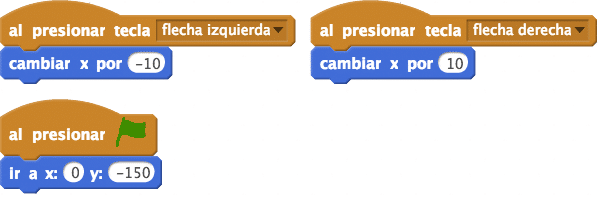
 Si
queremos mover la nave con las teclas de flechas de dirección, pues
vamos a ello. Al presionar tecla flecha izquierda, cambiar la coordenada
X por el valor que queramos; ídem con la tecla flecha derecha.
Si
queremos mover la nave con las teclas de flechas de dirección, pues
vamos a ello. Al presionar tecla flecha izquierda, cambiar la coordenada
X por el valor que queramos; ídem con la tecla flecha derecha.Pero la nave por si misma no es nada. Es necesario crear una bala con la que disparar a las naves enemigas, que puede ser perfectamente un rectángulo blanco. Es un nuevo objeto con una acción: cuando presionemos una determinada tecla —por ejemplo, espacio— irá a donde esté la nave, apuntará hacia arriba y se moverá hasta que toque el borde. Listo.
Segundo, los enemigos
Para crear las naves enemigas del Space Invaders en Scratch podemos recordar lo que hicimos con el proyecto de Arkanoid, de hace unas semanas: utilizar clones es más complejo, pero lleva a resultados más potentes; si no te atreves, simplemente crea un puñado de objetos que tengan el disfraz del enemigo (échale un vistazo a Google, porque hay GIFs que facilitan la labor).Lo principal es la posición en la que aparecerán los enemigos. Prueba por ejemplo a colocarlos en fila, uno junto al otro. ¿Cómo? Tan sencillo como que su coordenada y sea la misma, mientras que la x variará según el tamaño de tu objeto. Prueba diferentes posiciones hasta que consigas las agrupaciones que deseas.

Una vez la tengas, tus enemigos tendrán que interactuar con la bala: si tocan la bala, desaparecerán —o el clon será eliminado—, ¿adivinas cómo? Pistas: habrá que comprobar… por siempre, si el enemigo está tocando la bala. Cuando la toque, que se esconda. Fácil, ¿no? Una vez más, recuerda que hay otras muchas soluciones a esta problemática.
Hasta el infinito… y más allá
Ésta es sólo una breve introducción al Space Invaders, que como siempre os planteamos como proyecto base sobre el que continuar mejorando. Cuidado, porque engancha y te puedes tirar media tarde programando… y la otra media, jugando. A continuación unas cuantas mejoras que puedes añadir.- El Space Invaders original tiene unos muros de defensa que separan nuestra nave de las enemigas. Prueba a añadirlos y que si los disparas, se vayan desgastando.
- Falta un elemento clave: que los enemigos disparen. ¿Cómo hacerlo? Si lo has hecho con clones lo tienes algo difícil (por aquí unas pistas); si tienes objetos independientes será más fácil. Piensa en cómo dispara nuestra nave, y por ahí van los tiros.
¿Qué ocurre cuando destruimos todas las naves enemigas? Ahora mismo, nada. Crea una variable que vaya contabilizando las naves que destruyes, y cuando las tengas todas, manda un mensaje de que te has pasado el nivel…
- … o mejor aún, añade un segundo nivel en el que las naves vayan más rápido, o disparen más. Y un tercero, y un cuarto, y…
- También falta una nave enemiga que espontáneamente aparecía en la parte superior. Créala de forma que se comporte como en el juego original.
- Y lo más importante, sé creativo: añade sonidos, parte clave en este juego. También puedes poner distintos colores, muñecos, formas, movimientos… ¡lo que quieras!
El proyecto Scratch de los viernes es la sección en la que, cada quinto día de la semana, proponemos una idea de proyecto y damos algunas pistas para llevarlo a cabo. Hemos hablado de movimientos, figuras geométricas, historias, juegos de preguntas y respuestas, videojuegos… ¿Quieres saber más? Échale un vistazo a las ideas recopiladas en este enlace o al estudio Educación 3.0 en la comunidad de Scratch donde estamos incluyendo nuestros proyectos de los Viernes. Y por supuesto, ¡cualquier propuesta o sugerencia que tengas será bienvenida!
Suscribirse a:
Comentarios (Atom)


